Biography Project - Ray Johnson
16. Fade to black.
15. The Dia De Los Muertos card provided the sense of art and creative energy in death.

14. This one isn't so esoteric, right?
13. Seemed to appropriately encapsulate Ray Johnson's strange interactions with the outside world through his art.
12. Like so.
11. Mostly, the garish colour scheme made me think of the shock Ray Johnson had experienced and how profoundly it had disturbed him. The postcard image also coupled with the next one as the subject matter was somewhat interrelated.
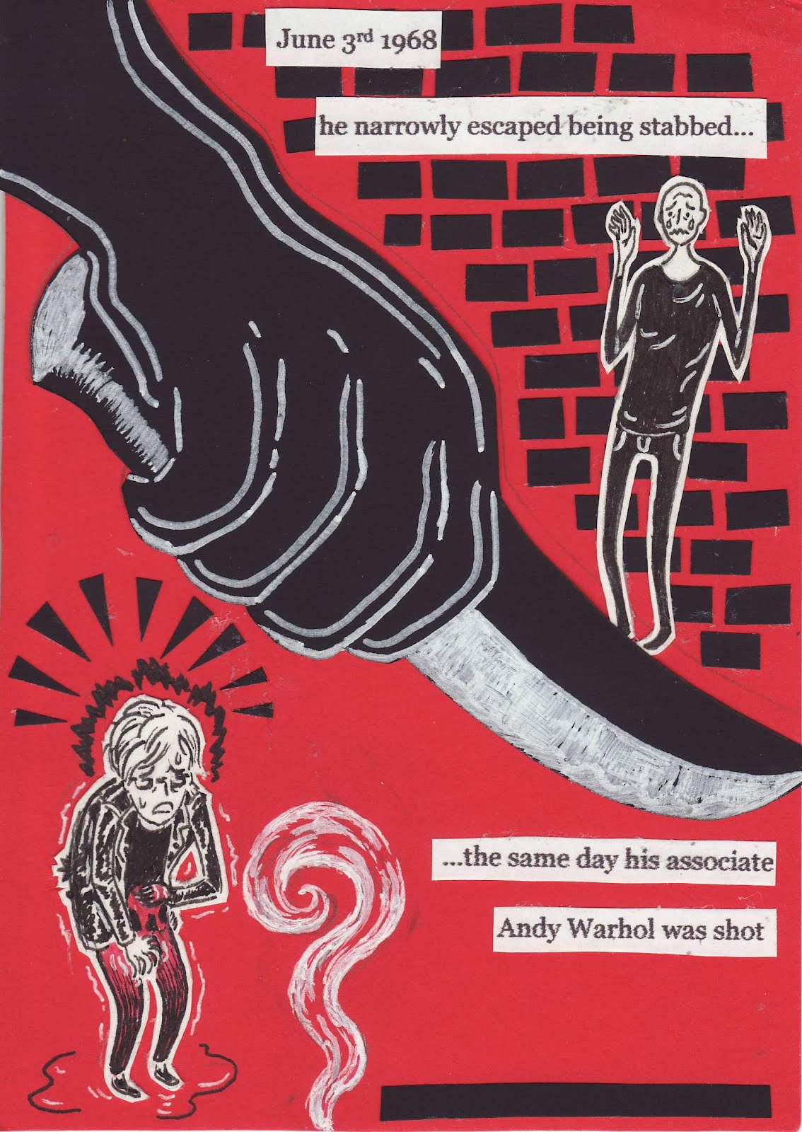
10. The two angels with their contrasting colour schemes helped to highlight both the differing characters yet similar circumstances between Warhol and Johnson.
9. The postcard image just seemed quite fragmented. Best match I could find.


 14. This one isn't so esoteric, right?


No comments:
Post a Comment