Sunday 3 June 2012

Biography Project - Ray Johnson

16. Fade to black.
15. The Dia De Los Muertos card provided the sense of art and creative energy in death.
14. This one isn't so esoteric, right?
13. Seemed to appropriately encapsulate Ray Johnson's strange interactions with the outside world through his art.
12. Like so.
11. Mostly, the garish colour scheme made me think of the shock Ray Johnson had experienced and how profoundly it had disturbed him. The postcard image also coupled with the next one as the subject matter was somewhat interrelated.
10. The two angels with their contrasting colour schemes helped to highlight both the differing characters yet similar circumstances between Warhol and Johnson.
9. The postcard image just seemed quite fragmented. Best match I could find.

Saturday 2 June 2012

8. Seemed like a fitting match between the collage and card with the assortment of logos and the composite portrait of Johnson.
7. Just associated the villainous republican on the postcard to capitalism I suppose.
6. I somewhat regret not using a bit more white to break up the image and make it more dynamic. But as it is, it contrasts quite well with previous collage. The postcard image was chosen because it was similarly chaotic.
5. Attempted to combine the japanese 'ensō' symbol associated with zen philosophy with Johnson's 'how to draw a bunny' creation. The postcard image somehow brought to mind rock gardens so I coupled the two together.
4. Seemed like the best was to talk about his place in pop-art. The format of the postcard helped reinforced the imagery.
3. See? Also, I like the psychedelic aesthetic as it sums up the 60s Ray inhabited pretty well (as someone of such youthful vigour I can only assume this).
2. I married the postcard image with this collage because it seemed to show a sort of hustle-bustle of activity that one would expect in the city while the replendence of its colours linked nicely with the third postcard, especially considering how closely related the visuals of the collages were between them.
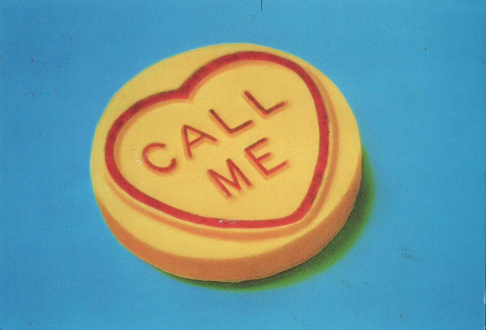
1. My first postcard of my series chronicling some of the life and most of the death of artist Ray Johnson. I worked on postcards as Johnson became reknowned for his mailart. Had I more time I would have liked to have sent them to people with his 'please add to and pass on' message attached. As it is, I tried to link together the imagery of postcards with the collages (the collage approach was another choice inspired by his own artistic methodology, in addition to the use of red upon predominantly monochrome visuals) however tenuously. In this instance, I attached the term 'vacant' to college vacancies.